Showing posts with label Joen Wolfrom. Show all posts

Tuesday, July 12, 2011

Simple shapes in quilting

Last week we featured top designers whose easy-to-piece quilts feature simple shapes: squares, rectangles and/or triangles. The results are simply beautiful ! The original articles are: Simple dimensional shapes:  Joen Wolfrom Designs; Simple modern shapes: Esch House Quilts; Simple shapes, jelly rolls and i Candy; Simple shapes by Diana and Laura; Simple shapes in fabulous fabrics; and Simple shapes: jelly roll quilts and other confections.  Links to the designers' sites are below the photos.


Row 1: Joen Wolfrom, at JWD PublishingRow 2: Debbie Grifka, at Esch House QuiltsRow 3:  Stephanie Sheffield, Amy Walsh and Janine Burke, at Blue Underground Studios. Row 4: Laura Nownes and Diana McClun, at Laura Nownes. Row 5: Pamela Goecke Dinndorf, at Aardvark QuiltsRow 6: Lori Allison, at Allison Quilt Designs.

Friday, July 8, 2011

Simple, dimensional shapes: Joen Wolfrom Designs

We've always been partial to dimensional quilts, and Joen Wolfrom is a master of the genre. Joen has been part of the quilt-teaching and designing scene for 30 years, and she is known for her expert use of color and her simple, clean design lines. Joen is the owner of JWD Publishing, a pattern company that publishes high-quality patterns for quilters of all skill levels and interests.

Northern Lights, by Joen Wolfrom, at JWD Publishing


Northern Lights is based on a simple rail fence pattern, made with 1-3/4" strips. The variations in value and color from one block to the next make this quilt's beautiful, yet simple design vibrate with energy. "Northern Lights" is also a stunning example of a rainbow quilt.  We took this photo last year at the 32nd anniversary of The Cotton Patch in Lafayette, California (the quilts were hanging from the trees !)

Stepping out, by Joen Wolfrom, at JWD Publishing


The shading of four-patch and square-within-square blocks gives an interesting optical illusion; the warm four-patch blocks in the lower right advance, while the cool four-patch blocks in the upper left recede.  The variations in value, and the color contrasts, keep the eye moving across the surface of this quilt. See if you can identify the focal point.

Tropical Morning, by Joen Wolfrom, at JWD Publishing


"Tropical Morning" is made entirely of simple half-square triangles.  The lattice arrangement of light, medium and dark values creates a variety of three-dimensional shapes, from pyramids to prisms.  You probably know about Joen Wolfrom's popular books on color in quilting... this quilt is a striking example of the use of analogous blue-green and green-yellow color schemes.

Image credits and links: For more information, see Joen Wolfrom's website. Her latest book, Adventures in Design, will be released in the fall of 2012 and joins Joen’s other books, including Visual Coloring, Color Play, The Visual Dance, and many others. Joen Wolfrom is also the inventor of the popular 3-in-1 Color Tool.  You can also find JWD Publishing on Facebook.

Friday, May 13, 2011

What do you think about red, yellow and blue?

In the previous post we showed red and blue quilts, and mentioned that ivory and/or beige is a great complement (better than white, in our humble opinion).  Even a hint of yellow is enough to round out a predominantly red-blue scheme, as shown in this wonderful scrappy quilt by Will Vidinic of Will's Quilts in Paris :


It's amazing how often we see red, yellow and blue in classic quilts.  Consider the vintage Spanish-American war quilt shown below (seen at auction), which we like better than flag quilts done only in red, white and blue...


...and this vintage crib quilt which uses just a hint of yellow in the strips separating the orange and blue blocks:


and the famous Gee's bend denim quilt by Annie Mae Young, which graces the cover of The Quilts of Gee's Bend (published by Tinwood Media):


and what do you think about this early 20th century Afro-American quilt seen at auction? The blue dots at the intersections really cool down this fiery color scheme :


Many 20th century artists explored variations of red-yellow-blue, including Piet Mondrian, Alexander Calder, Mark Rothko, and Ellsworth Kelly.  Ellsworth Kelly created his famous Blue Yellow Red IV in 1972:


In the past, we thought of red-yellow-blue as THE primary colors, as on the Itten Color Wheel. However, RYB is a historical set of primary colors that predates modern scientific color theory (see RYB color model). Using RYB as primaries yields a relatively small gamut, in which, among other problems, colorful greens, cyans, and magentas are impossible to mix, because red, yellow, and blue are not well-spaced around a perceptually uniform color wheel. For this reason, modern printing processes, as well as color photography, use cyan, magenta and yellow as primaries (CMYK, where K is black). We're training ourselves to use the 24-part Ives color wheel, which is based on CMYK (see Color Play by Joen Wolfrom).  Here is a split-complementary scheme that features blue with its orange-yellow complement in the middle, and additional warm hues on either side, as shown on the Studio Color Wheel by Joen Wolfrom :


Many artists and quilters still work with Blue-Yellow-Red as primaries.  But as Joen Wolfrom points out:  "If you use red, yellow and blue for your complements, you're two steps off. That doesn't make an ugly quilt, but you could use the right color wheel and it would be stunning rather than okay."  We would love to know if Ellsworth Kelly has changed his view of Blue-Yellow-Red in light of modern color theory (Kelly was born in 1923, and is now 87 years old).  Let us know what you think !

Tuesday, May 10, 2011

What makes this color scheme work?

We're intrigued by red-and-blue color schemes. What makes these colors work together? Red and blue are neither complementary nor analogous colors, yet they can be beautiful together... but only if the right hues and shades are carefully chosen. For example, here is a stunning mariner's star quilt by Judy Mathieson. Do you like this color scheme ?

Scarlet and Indigo, 16 x 16, by Judy Mathieson, for the Alzheimer's Art Quilt Initiative


The names "Scarlet and Indigo" have an almost mystical connotation. The deep shades of red and blue remind us of the famous Rothko painting called "Number 207", below:

Number 207, aka Red over Dark Blue on Dark Grey, 1961, 92.8 x 81.2, by Mark Rothko, as seen at the Berkeley Art Museum/Pacific Film Archive


Is this "scarlet" is a true red, or more of an orange-red, or a blue-red?  The online color thesaurus suggests that "scarlet" is equivalent to coral red and "indigo" is equivalent to blue-violet.  To check it out further, we did an online color analysis of the "Scarlet and Indigo" quilt using a handy website called Kuler* ("kuler" is pronounced like "color", not "cooler").  On Kuler, you can upload an image and obtain exact color values for different portions of the image.   Here is the result for the "Scarlet and Indigo" quilt (click on the image to see the detail, including RGB, CMYK and hex values):


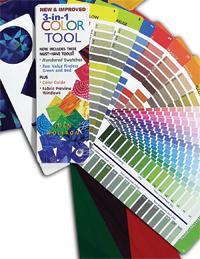
Comparing these RGB and CMYK values to the Ultimate 3-in-1 Color Tool by Joen Wolfrom, we can see that "indigo" is a very dark shade of true blue (blue plus black) while "scarlet" is a deep shade of orange (orange plus black). These hues are not complementary, but we think they are beautiful in these dark shades. The navy blue is so dark that it "reads" as a neutral; in the Rothko painting it looks black.  Perhaps that's one key to the success of this scheme.

What about red, white and blue... do you think they go together ?   Many flags use this color scheme, such as in this striking vintage quilt top seen at auction (below).  This quilt has plenty of white space, which was used to separate the blocks and avoid visual overload.


We like red, white and blue in flags, but we've seen examples where the blues and reds clash or where the pattern is too brilliant.  What do you think of the combination of periwinkle with red in the fabric below?


And what about this cerulean blue and orange-red combination, below ?


The color combination above just doesn't work for us... cerulean blue's complement is yellow-orange, not red-orange, so this combination seems to clash. Also, you'd think that white would be neutral, but we just don't like white with orange-red.   (It's not that we don't like orange-red per se; it looks stunning in combination with aqua blue, as shown in the fish quilt in our complementary colors post).

As an alternative to white, we love blue and red with gray. For example, consider the combination of dark navy blue with scarlet in "Waves" (below) by Beth Carney at Beth Carney Studio :


A combination of blue and red with cream, ivory, or beige is also an option, as in the Celebration of Freedom quilt by Judy Laquidara, shown below.  The center star is set on a white background, which makes it stand out, while the star blocks are surrounded by a warm beige.


Actually, the beige in the above quilt is a tone of golden-yellow (golden-yellow plus gray), which explains why this quilt is successful: it is really a three-color or "triadic" color scheme with tones of red, blue and yellow.  For more examples of quilts with triadic color schemes, stay tuned for our next post.

Take-away points and notes to self:

- Consider using a dark (navy) blue as in "Indigo and Scarlet" and "Waves", or muted (grayed-down) blues and reds, as in many civil war quilts.

- Remember the complementary pairings:  blue-violet with golden yellow; blue with orange-yellow; cerulean blue with yellow-orange; turquoise with orange; and aqua blue with orange-red. Use the ultimate 3-in-1 color tool as a guide to fabric selection.

- When using blue and red together, consider substituting ivory, beige or gray for some or all of the white, as in "Celebration of Freedom" and "Waves".

Finally, we'd love to know about any blue-and-red or red-white-and-blue quilts you've made, and why they were successful!

Image credits and links:  Judy Mathieson's website can be found at Judy's Place.  "Celebration of Freedom" by Judy Laquidara was first shown in our Celebration of Freedom post; you can find Judy Laquidara at the Patchwork Times.  "Waves" by Beth Carney was first shown in Quilters Remember September 11.
*Note that the Kuler website uses a traditional color wheel, for example, where red is opposite or complementary to cyan. In our complementary colors post we discussed why it is better to use the Ives color wheel.  As mentioned above, we first assess CMYK values using color extraction tools like Kuler, then use the ultimate 3-in-1 color tool to find the best complement.

Thursday, March 24, 2011

The Color Series: complementary colors, cool tools, and hot tips !

The correct use of color is key to an aesthetically pleasing design.  Experienced designers seem to choose colors intuitively. Clearly, the artists who made the beautiful quilts shown below all had a great sense of color.  We want to apply this sense of color to our own quilts, so we're launching a mini-series on color schemes and color tools...and we've got some hot tips to share with you ! 

Antique Orange and Blue Tumbling Blocks Quilt, circa 1880, at Material Pleasures; Double Wedding Ring Quilt, Meander Publishing Quilt CollectionHigh Hopes by Sally Dickinson, at the 2010 Arizona Quilters Guild Show


In school we were taught that there are three primary colors (yellow-blue-red) and three complementary pairs (yellow-violet, blue-orange, and red-green). Now we realize that there are many more hues in the spectrum. Each of the quilts shown above has a different hue of blue, from true blue to aqua, and a different complement that ranges from yellow-orange to orange-red. Color theory should make it easier to create these complementary pairs... but which tool(s) are the best ? 

Color Scheme Designer:   This free web tool will facilitate finding an optimal color palette based on a traditional yellow-blue-red color wheel. Go to Color Scheme Designer and click somewhere on the color wheel to pick a starting color, like Orange, then click on the "Complement" button above the wheel.  You will see the color scheme shown below: 


Once you have a palette, you can even view it in terms of standard Pantone colors; just click on the "color space" tab at the upper right of the screen, as shown below.


By playing around with Color Scheme Designer for just a few minutes you can learn a lot about color schemes. For example, try shifting the color wheel towards red and see how the complement shifts, and try out the triadic, analogous and accented analogous schemes!

The Ives Color Wheel, and the Ultimate 3-in-1 Color Tool (3rd edition) by Joen Wolfrom 

The Ultimate 3-in-1 Color Tool is based on the Ives Color Wheel, below, which is significantly different from the traditional color wheel used in Color Scheme Designer. You can take the 3-in-1 tool to the fabric store, which makes it exceptionally useful; but does the Ives color wheel really make a difference?

click to enlarge the image

The short answer is 'yes'. Joen Wolfrom explains*: "Most of us learned that the primary colors are yellow, red and blue. A color wheel using these three primary colors results in blends not nearly as beautiful or dynamic as the yellow-magenta-turquoise combination used in the Ives Color wheel." Also: "If you used the 24-step color wheel we grew up with, with red, yellow and blue for your complements, you're two steps off. That doesn't make an ugly quilt, but you could use the right color wheel and it would be stunning rather than okay."

Since "stunning" is what we're aiming for, we did an experiment: we started with a tint of aqua blue (slightly lighter than pure aqua blue) which is at about -8- on the Ives wheel. Its complement, which is directly opposite on the wheel, is orange-red (-20-) (below, left).


In contrast, Color Scheme Designer - which is based on a traditional color wheel - predicted an orange-yellow complement (above, right). As Joen says, the two schemes are at least two steps off.  Which one do you prefer? (Leave us a comment).  Now look again at the quilts at the top of the post: they all have complementary color schemes that match the Ives wheel, and the fish quilt uses a stunning aqua blue and orange-red color scheme that is similar to the one in our experiment.  Since the Ultimate 3-in-1 Color Tool now includes HEX, CMYK and RGB formulas, you can cross-reference the Ives hues with all other sites and programs. Now that's cool (er, hot).

Finally, here is a fascinating story about the history of the traditional color wheel, direct from Joen Wolfrom:

"While I was doing research for my upcoming book, Adventures in Design, I found some answers to questions that I have wondered about for a long time. I have always wanted to know where or how the yellow, red, and blue color wheel originated. Here’s what I found in my recent investigation:

The historic color wheel (primaries of yellow, red, and blue) was devised by a small group of artists more than a century ago who felt the need to organize their pigment colors in an understandable fashion to help them with color selection. They placed blobs of color around a circle showing their available pigments. It became popular to make one’s own informal color circle to help organized color, using the various pigments on hand. Eventually a printing house printed a circle of color for artists that offered a logical, easy color reference based on this idea. Hence, this color wheel has been our reference for decades.

Not surprisingly, modern technology has led to new discoveries in color study. The physics of color is a vast field and we should be taking advantage of much of the information that is now available to us, due to color research. Admittedly, it is sometimes hard to say goodbye to old habits. Most of us no longer read by lantern nor cook from a wood stove, although these were the acceptable modes of attaining light and heat when the first color wheel was created. Nature hasn’t changed its way of coloring the world, but with the modern equipment available to us, the way we use color in our homes, our art, and our business can be so much more effective if we use the knowledge of today rather than the rather informal assumptions of yesteryear."

Stay tuned, because we have more cool tools, hot tips and insights to share with you in upcoming posts!

*More links:  You can read about the Ives color wheel - and successful color schemes - in ColorPlay, and listen to an interview with Joen Wolfrom at Penny Halgren's How-to-Quilt site.

Wednesday, March 9, 2011

Can you believe it's a storm-at-sea ?

We had to peer at this fantastic quilt for a few minutes to realize that it is, indeed, a storm-at-sea quilt. The designer and author, Joen Wolfrom, has cleverly created a summer garden with giant sunflowers against a blue sky.  Her amazing design, which goes beyond the traditional sea theme, makes us think about this pattern in a whole new way !

Summerfest Garden, design by Joen Wolfrom, at Joen Wolfrom and JWD Publishing


In the close-up photo, below, it is a little easier to see the storm-at-sea block elements...


Summerfest Garden graces the cover of the book, A Garden Party of Quilts, by Joen Wolfrom.  All seven of the flower quilts in the book are pieced, and there are some real beauties - tulips, clematis, poppies, and more - created with various block patterns.

When we told Joen about our interest in storm-at-sea quilts, she was generous enough to share another design: a landscape quilt which is another wonderful example of Storm at Sea possibilities. The design, called Majestic Mountains, has not been made yet and is waiting in the wings. Wouldn't this make a gorgeous quilt? 


With the gridlines removed, you can see how the quilt will look (below). Joen Wolfrom makes her home in the Pacific Northwest, and these peaks remind us so much of the majestic Olympic Peninsula.


Notice the way in which the mountains get lighter as they fade into the distance?  Joen talks about this in her Landscapes and Illusions book. We've learned a lot from Joen Wolfrom's books, and we love her ultimate color tool (it's been called indispensable, which sums it up).

.
Image credits and links: Images are shown with the kind permission of Joen Wolfrom.  Joen began quiltmaking in 1974, and she has taught and lectured in the quilting field, both nationally and internationally, since 1984.  She heads up JWD Publishing, a worldwide pattern company that features Joen's own designs along with many other superstars in the quilting world. Additional credits : Summerfest Garden was pieced by Jeanne Lounsbury and quilted by Karen Dovala. You can find Karen Dovala at The Quilted Moose.

Thursday, April 29, 2010

Look to the rainbow

Why are rainbows so appealing? For one thing, the colors of the rainbow create visual harmony when placed together (a "six tone chord" in color theory). And then there's the symbolism of the rainbow, denoting hope and prosperity, and inspiring many songs and movies (including Over The Rainbow, Finian's Rainbow, and Rainbow Connection, among others). If you like rainbows and quilts, as we do, then we think you'll like today's post. We've curated an inspiring collection of quilts in rainbow shades, in a wide range of styles and designs. At the end of the post we're also revealing some of our favorite fabrics, color wheels, and some fantastic color matching tools (and we'd love to hear about your favorites, too...)

Pinwheels, 47 x 47, by Martha Tsihlas, Del Sol Quilts


Martha Tsihlas is a quilter and fiber artist in Austin, Texas, whose outstanding work has been featured in galleries and in juried exhibits, including Textile Twists in 2010. Her Big as Texas quilt graced the cover of the fiber arts exhibit at the Texas State History Museum. We love "Pinwheels", an original Martha Tsihlas design, which features interlocking pinwheels in all colors of the rainbow. Each hue is represented in several different shades and textures, adding further interest to this beautiful quilt. For more information on Martha Tsihlas and her artwork, visit her blog, here.

Batik Wheel Dance, 45 x 56, by Carol C. Britt, as seen at Sew What Fabrics & Batiks, Etc.


In the beautiful Batik Wheel Dance, above, the colors of the rainbow are arranged in diagonal bands, and each color subtly blends into the next. The overlapping circles look like Cathedral Windows, but are made on the machine! The totally ingenious pattern, called Circular Patchwork, was designed by Carol C. Britt, who is the owner of Sew What Fabrics & Batiks, Etc. Also see the Island Batik Color Wheel Collection, later in this post.

Northern Lights, by Joen Wolfrom, at JWD Publishing


When it comes to color, Joen Wolfrom wrote the books (literally). Here we're showing "Northern Lights", which is one of Joen's classic designs. The lustrous effect is created by subtle value changes—using light to dark hues in each block, creating a wonderful sense of depth. We've seen this pattern done in black and white, too, with stunning results. Also note the beautiful sun-shaped quilting design, which is visible at the top of the quilt. To read about the pattern, visit JWD Publishing.

Flying Around the World, 48 x 60, by Liz Schwartz & Stephen Seifert, at eQuiltPatterns


We love the fact that this design team has created patterns inspired by the simple elegance of Amish designs. Amish quilts are known for their pure color play, in which simple shapes in solid colors are arranged against a dark background. "Flying Around the World", above, is reminiscent of a traditional Trip Around the World quilt, but with the visual effect of an op-art painting. The pattern can be obtained here; to see more designs, visit eQuiltPatterns. (For a contemporary rainbow quilt, also see "Cool Rainbow Weave", at Quilts With Style).

Skewed Nine Patch, 53.25 x 52.5, by Janes Wilson, at Jane's Quilts


Jane Wilson (Brisbane, Australia), has come up with a sensational "Skewed Nine Patch" quilt in a rainbow of colors. There are 100 different nine patch blocks, and each block is constructed of three different fabrics; the blocks are surrounded by a grid of navy blue sashing. The skewed lines of the blocks create vertical and horizontal movement and a lively pattern. We also love the back of the quilt, shown below, which has one enormous skewed nine patch block (it's a work of art, in and of itself!) For more details, and to see the quilt at her online store, visit Jane's Quilts. (Note added 2-5-2011: this website is no longer active)


Shazam, 27 X 37, by Linda Everhart, Quilting Among Friends


Linda Everhart is a designer and nationally-known teacher. Her dynamic rainbow quilt, above, has circles and ovals that zoom out from the background; a flock of flying geese that travel from corner to corner; and a border of rainbow squares, reminiscent of a film-strip. To facilitate the construction of quilts like "Shazam", Linda has developed a neat technique called FUSIQUE®: a raw-edge reverse fusing method that enables speedy assembly. For the pattern, visit Quilting Among Friends. (Note: although the quilt may or may not be inspired by the ancient wizard of the same name, we like the story of 'Shazam': S stands for the wisdom of Solomon...)

Pizzazz, by Joen Wolfrom, JWD Publishing


"Pizzazz", above, is a dazzling half-rainbow quilt that reflects a brilliant design by Joen Wolfrom. Of course there is color: the radiant colors move subtly from yellow to violet in diagonal bands. And then there is movement: the bands of color create undulating waves. And then there is the construction: this quilt’s block is constructed with four shapes and only three straight seams. The "waves" are an optical illusion created by straight piecing lines that intersect at wide angles, resulting in a gentle zig-zag pattern that ripples across the quilt. Finally, there is another illusion: the arrangement of dark and light values of the triangles within each block creates a three-dimensional appearance, similar to a pyramid. For more information, visit the Pizzazz webpage; to see all Joen Wolfrom Designs, click here.

Garden Rainbow Quilt, 82 x 76, by Roberta Horton for Kaffe Fassett, as seen at Tennessee Quilts


"Garden Rainbow", by Roberta Horton, is one of the lovely quilts featured in Kaffe Fassett's Country Garden Quilts book. Although the pattern is straightforward, there is genius in simplicity: the horizontal stripes are comprised of floral prints in a muted rainbow of colors, while the vertical stripes are comprised of matching florals, solids and stripes laid in an alternating dark/light brick pattern, giving the appearance of a complex geometric design. Tennessee Quilts has the complete quilt kit, as well as the kits for dozens of other Kaffe Fassett quilts and, of course, Fassett's fabrics.

Color Wheel Quilt, 56 x 56, by Joelle Hoverson, at Purl


This clever quilt has become a design sensation ever since it appeared on the Purl Bee. The project is from the book "Last Minute Patchwork + Quilted Gifts" by Joelle Hoverson, the co-owner of Purl Soho. The colorful bundles of fabrics, below, contain 52 different cotton prints to assemble the color wheel (or use them in another colorful project!) See the original description of the quilt at The Purl Bee and the updated version of the fabric bundles here. The book can be found here.


Color tools and other fantastic finds

In honor of color wheels, rainbow quilts - and quilters everywhere - here are a few of the color matching tools and products we love:

3-in-1 color tool, by Joen Wolfrom


In 2002 Joen Wolfrom developed the 3-in-1 Color Tool for selecting colors and fabrics; you can just take it along to the fabric store to find fabrics that work together. It's been called "indispensable", which pretty much sums it up. For details and product reviews, visit C&T Publishing, here.

Island Batik Color Wheel Collection, as seen at Batiks Etc. & Sew What Fabrics


These beautiful cotton batiks are available in handy fat quarter bundles: 25 fat quarters in cool colors and 24 fat quarters in warm colors.

Hoffman Bali Color Fan, as seen at Batiks Plus


This is impressive: a color fan with a tiny swatch of all the Hoffman Bali batiks; there are over 300 colors. The color fan is available at Batiks Plus.

Fabricmatcher, at Moda Fabrics

Moda Fabricmatcher is an extremely clever online tool for finding fabrics in particular colors: and it is easy and fun to use. Just two clicks and you're there - there's no program to learn! Fabricmatcher will either match fabrics to a color you pick from a large palette (see color matcher), or it will identify key colors from a photo, then allow you to search for fabrics based on the key colors (see upload an image.) We selected a photo of red begonias from our photo album, and here's what we got (click on the screenshot image, below, to see a larger view):


Not bad! Keep in mind that the tool detects an average for each color. The green leaves in the photo - which were partly in the shadow - showed up as a very dark green, but the orange-red flowers are well matched. The next step would be to select one of the five colors, a theme, designer and collection, and Moda will show all of the fabrics that match. To try it yourself, click here (and let us know what you think!)

Image credits: All images are used with permission of the artists.